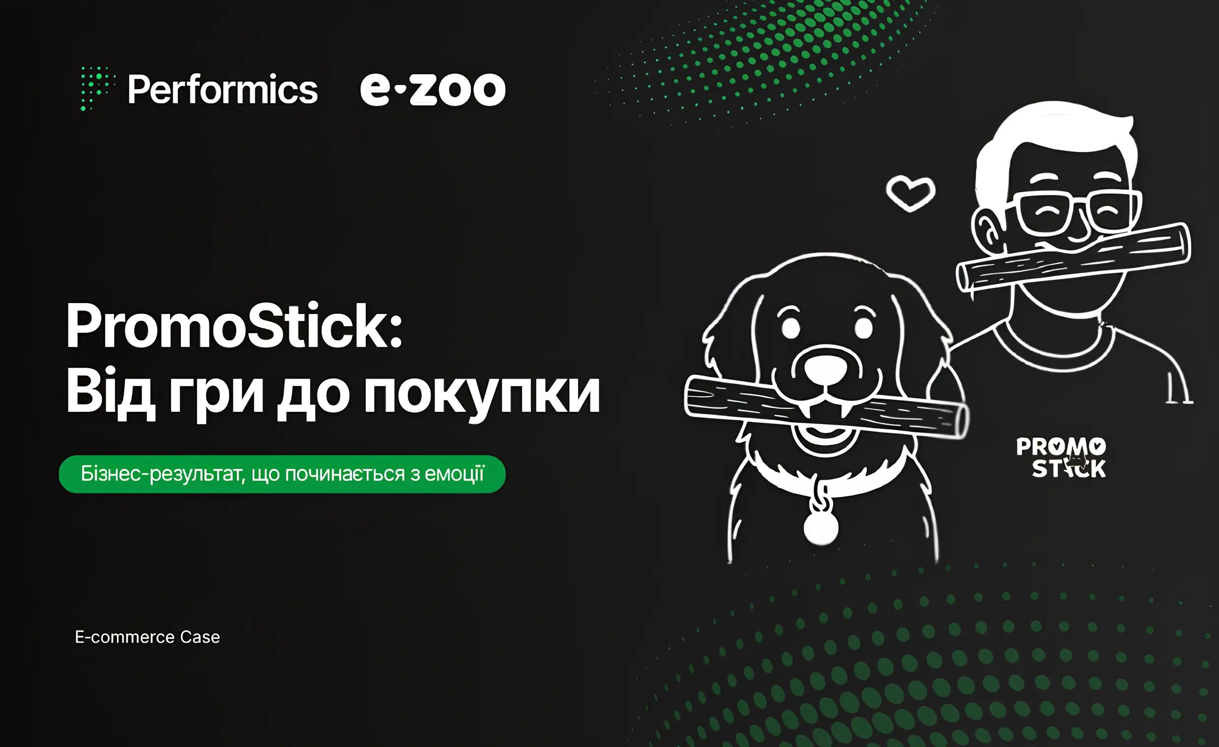
WORK WE ARE
PROUD OF
Goals
The Credo Bank team decided to update the mobile app to modernize its design and add new daily banking services to meet the needs of users of the bank’s products. An additional goal was to increase the app’s rating in the AppStore (2 points) and Google Play (3 points) to at least 4 points. Our task was to carry out a set of measures for ASO optimization of pages in the AppStore and Google Play: to increase trust through ratings, improve organic visibility, and increase conversion to installation by at least 20%.
Challenge
Updating a mobile app for a bank is a strategic step, so all the details must be taken into account. In the banking category, 56% of users choose an app for daily banking (source: PACE Panel, 2025), and each star in the rating represents trust that converts into installs. Kredobank faced a challenge: the app had become much better, but the previous UX (user experience) had left behind low ratings and negative reviews. An additional challenge for us and the bank’s team was the decision to publish the updated app on the existing AppStore and Google Play pages, which is more difficult than creating pages from scratch.
We were faced with the task of breaking down the bias formed by the previous version and showing the true face of the updated Kredobank.
Insight and strategy
In the banking category, the decision to install is made in seconds: not based on a list of features, but on trust. Users look at the rating, the first screens, the tone of communication, and instantly decide: “Is this my bank or just another set of promises with asterisks?”
Kredobank already had a clear positioning of “proper banking”: simple conditions, fair rules, no hidden nuances. This idea became the basis of the strategy: ASO should not just increase visibility, but translate this philosophy into the language of stories. Make content, texts, and visuals as honest and understandable as the product itself. To turn the page into an extension of the brand’s character, where every element confirms the image of “correctness.”
Execution
We started with a deep dive. The ASO audit included comparing Kredobank’s page with 15 market-leading competitors, checking compliance with store requirements, and evaluating technical indicators. We analyzed everything: from content to adaptability on different devices, from ratings and reviews to external links.
Visual audit: We moved to a modern creative format, where daily banking and key banking products became the priority. The new design helped to better reveal the value of the updated application.
The most interesting part began with working on the content. Using technical tools and AI, we identified user behavior patterns and collected over 600 relevant keywords, evaluating their monthly frequency of use. Every word and every phrase in the title, subtitle, and description now worked for visibility and conversion, reflecting the intentions of the target audience.
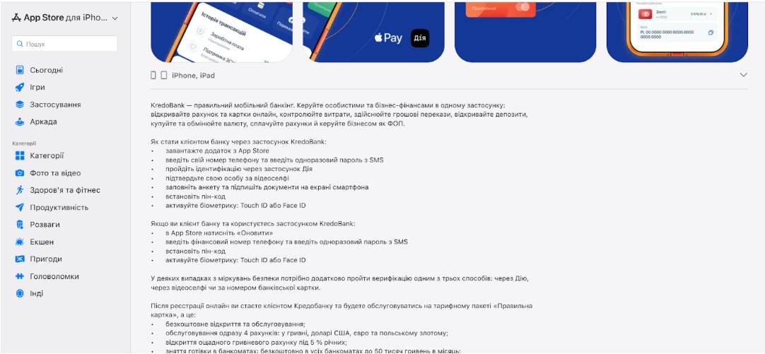
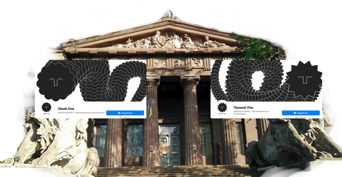
Image 1. Updated version of the app description in the App Store
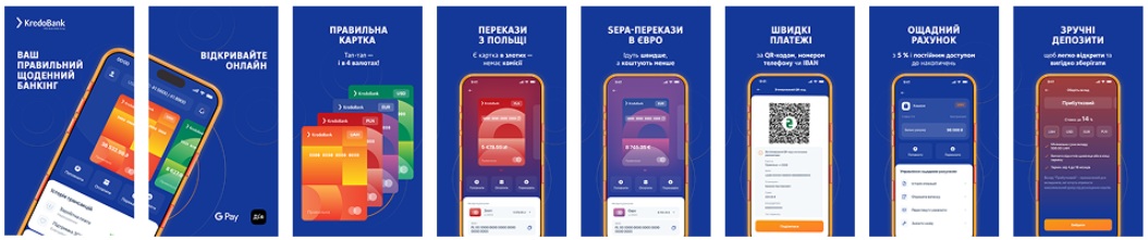
Image 2. New creative design for the App Store and Google Play
When preparing creatives, we found that video has a decisive impact on the user experience, in particular through the use of the “events” tool as an element of visual marketing in ASA. We created all visuals with storytelling in mind so that all materials worked as a single story: from the first glance to the install.
Advertising activity through Google Ads, Meta, ASA, and TikTok supported the overall momentum, and UX solutions became the “voice” of the updated product: the Kredobank team worked out trigger chains of push notifications in the app, which helped to get high ratings with a truly good experience with the app.
Results
After several months of fruitful work and technical implementations, we saw noticeable results by the end of December 2025:
- Organic visibility improved significantly, and the app began to rank for a greater number of queries (+36%), allowing new users to find our brand.
- The app’s rating increased significantly: +95% in the AppStore (from 2 to 3.9) and +38% in Google Play (from 3 to 4.2) and continues to grow in 2026.
- Most importantly, we increased the conversion rate from view to install by 25%.
The story of Credo Bank is about how the right communication in stores can reveal the true value of a product. The synergy of ASO, visual, and technical solutions transformed outdated perceptions into trust.
The rating has grown in line with improvements in the updated product, and organic visibility has begun to function as a stable source of new user acquisition.


Our Clients


What Our Clients Say

Anton Sokurenko
Ecommerce Specialist
I would like to recommend Performics team. They definitely are real professionals in the field of their expertise. Responsibility, proactivity and drive for results are key features of their work approach. I am grateful for the performed work.

Pavel Daniman
Chief Marketing Officer - Kyivstar
Kyivstar and Starcom have a long-term experience of cooperation. I must say, the agency have gained a reputation of a responsible, qualified and sufficient partner in planning and realization of media projects. Moreover, the agency team performance shows high quality and timeliness.
Now we have proceeded our cooperation – expert Starcom team provides Kyivstar with quality proposals and recommendations on media strategy. We are sure that it is cross-use collaboration targeted to reach full potential of company’s media goals.

Olena Kubyshyna
Marketing director, "Eurocar" Ltd
Together with Starcom we launched scores of media campaigns in 8 years of our partnership. Throughout this time, we are glad to get the same great results and keep the sustainable level of communication and relationship. Skoda is one of the leading brands in the sales rating with 7% of marketing share during this period. Our Starcom team is always willing to find the most effective solutions to reach our goals. It is also valuable we can release and concentrate our time and potential to other directions of brand and business development. I would also like to point out the high level of team proficiency in crisis situations. I am confident in my team.